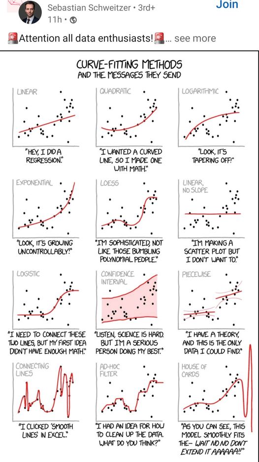
Oh, I just love this visual! This is the perfect example of making the narrative fit the data. In each case, the data dots are the same and have 12 different interpretations.
Keep this in mind when you are working on a complex task and can’t figure out why some people don’t see the same answer you do. They might not be wrong. They just see things differently than you. If it were me in this situation, I would ask many whys.


Comments are closed