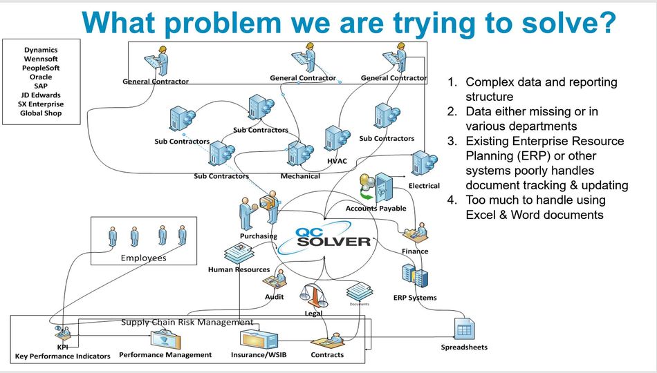
A spaghetti chart is a visual that shows how the supply chain data is collected and used. Often times information is managed by various stakeholders and systems. The common denominator is the use of Excel to fill in the gaps and Outlook to do the tracking. It takes time, and there are risks.
If your process looks similar to what I have outlined, then QCsolver can help. We are here to solve your gaps and pain points.


Comments are closed